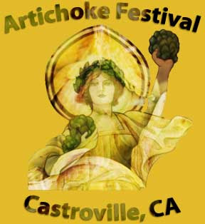
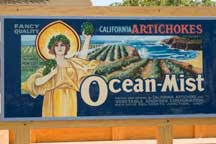
 Recently in my Photoshop class, we learned about clipping masks using objects and type. I'd just returned from the Artichoke Festival in Castroville where we saw a sampling of old crate labels. For my creative project, I was inspired to design a label for an event photo album. The image I submitted for my assignment is at the top on the right.
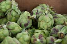
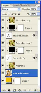
I started with two separate photos to create the label - one of an old produce truck and one of a crate of artichokes. For submission we were required to show the layers we used. The screenshot shows the ordering of the various components used to create the submitted image. The Layers palette doesn't show the opacity or the blending mode. I discovered that I didn't need the black layers for the text. I'd accidentally created the text in the same color as the label background.


 When I generated the label, I didn't like the look of the queen's straight edge versus the arched text. After some more tweaking, I came up with the following image. To create the queen's rounded edge I merged the two layers Artichoke and Artichoke Queen and then created a new layer with an Ellipse and set that layer as a clipping mask for the queen. The "final" label includes the year. Now I don't like the clipping of the raised hand with the artichoke so I'll return to the image to duplicate the raised arm and reinsert the arm on a separate layer. I can't believe how addicting digital image manipulation is!
NOTE: The brightness of the two images appears to be different. The color values for the background are the same in both psd files. The two differences in the process used to create the psd file and generate the jpg are: PC versus MacBook Pro and Photoshop CS2 versus Photoshop CS3 Extended. The "final" image is the color I chose when I initially composed the label.

